
ELEVATOR PITCH:
Ever wonder why Prius drivers are the most annoying drivers on the road? It’s because once there’s a live feed of the miles per gallon, the game of getting the best MPG outweighs speedy driving. I can confirm this because I own one. Now imagine a live feed of energy use at home? That’s mPower Me.
PRODUCT DESCRIPTION:
The idea came to me during Energy class. We had a measurement assignment and numerous students tracked their energy use over the course of a day. The numbers surprised everybody and this is a group of informed graduate students with a predilection towards energy conservation. It made me think of my Prius. Wouldn’t it help if we could see a live feed of energy use at home? The car changed my driving style overnight and saved me a lot of money on gas.
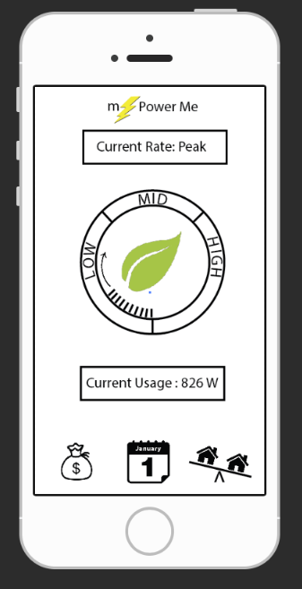
The genius of the Prius is it gives the driver feedback in a simple enough way to read while driving. I believe a similar design would also work for people’s homes – an easy display that can be ingested in a glance would be ideal. Then while getting a beer, cooking a meal or doing the dishes, a live feed would serve as a friendly reminder of current power usage. That is the base of the mPower Me design. The product should contain all of the important information on a simple home screen and any additional information a single click away.
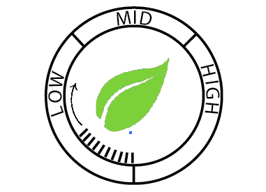
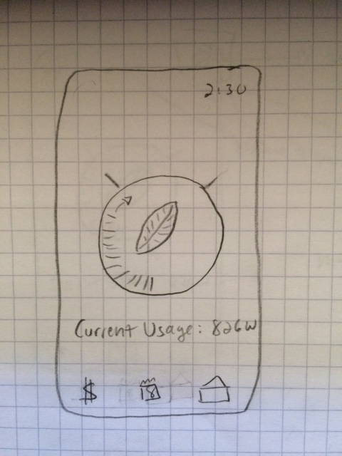
The main screen has a read-out like an odometer. As it moves around the circle, it lands in different segments of low, medium or high usage. And a large green leaf appears in the center when the energy use is low. This can be viewed from quite a ways away. A simple visual icon serves as a reminder to turn off lights, unplug unused electronics and maybe remind the user to turn off a TV no one is watching. mPower Me could change personal energy use with a glance.
COMPETITIVE ANALYSIS:
TED Pro Home
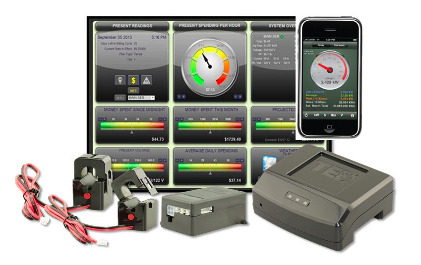
The TED Pro Home system has a base price of $300. The product is targeting the smart home market. The initial price includes the hardware and an ability to monitor the home through a website and an app. Additional monitors can also be purchased at different price points, black and white being the more affordable. The user can also buy additional products, allowing the system to read specific circuits or monitor solar and wind power installations. TED claims that people who view their monitors reduce power usage by 10%. A good argument for mPower.
Curb
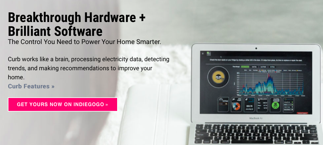
Curb is a similar smart home system. It looks like an incredible product designed by an ex-solar power executive and rocket scientist. Again, smart home is in the main description. It looks like a solid product, but for a specific “smart home” target market. Curb can only be ordered through Indiegogo and has a starting price of $399. Their Indiegogo site has raised over $167,000, but the numbers sold is still very low and again it is designed for a wealthier target market.
Nuerio
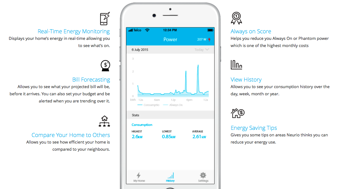
Nuerio is also in the “smart home” market, but its price point is slightly lower. To purchase the system without a monitor is $179. Then it can be viewed on an app or computer.
Nuerio also offers a smart home monitoring system for $249.99 and includes ways to get feed back on solar panels. The company claims the average home wastes 20-30% of energy which is even a higher number than TED Pro Home estimates. They also offer a feature to compare the home to other homes — something I definitely want to include in mPower Me.
COMPARATIVE ANALYSIS:
E.On
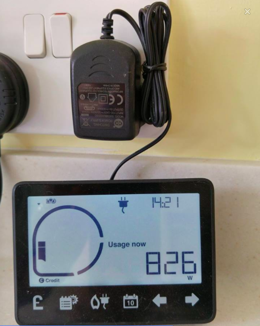
The above smart energy display was provided for my boyfriend’s sister, Nicky in the UK by her energy company, E.On. Unlike in the United States, there is a lot of competition for energy companies. Nicky had the choice of fifteen companies so each one vies for business by providing additional perks to their customers. She chose E.On and received this energy monitor with the service.
Since it is provided to all customers, this is the model I am most interested in. I want mPower Me to be the cheapest possible to see if there is a way to get energy companies to give them to their customers. My feeling is if the read-out is free or extremely cost effective, it can lower power usage while saving money for families on a budget – not simply smart home type customers.
Nicky loves the monitor and says it has had an impact on their energy usage. The monitor sits in her kitchen and she and her husband find themselves turning more items off when they glance over at the monitor. This is exactly the type of product I also noticed the black and white monitor. It is more cost effective than a color display, allowing the product to be mass produced for an average consumer more easily.
Toyota Prius
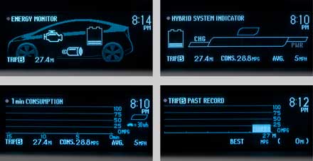
The Toyata Prius was my initial inspiration for the product. The car has sold incredibly well in the United States so I know it works well for its customers. And as a Prius owner, I can attest to how effective the screen is for my own personal habits. My goal of the mPower Me design should mirror the simplicity and effectiveness of the Prius.
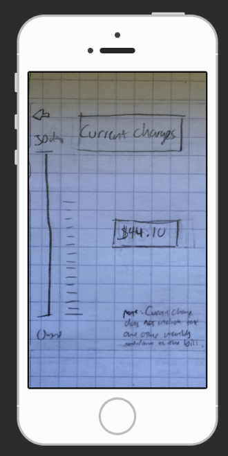
ROUND ONE OF SKETCHES
I began by throwing down some ideas about how the data would be displayed as the power usage goes up and down.
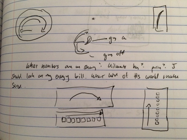
Next I started the first real design of the home screen. Although Nicky’s monitor in the UK was landscape, I felt that readout should be portrait so that the home monitor would mirror the app. It would lead to easier usability if both screens were identical.
SURVEY AND USER RESEARCH

CHARTS OF SOME OF THE RESULTS:
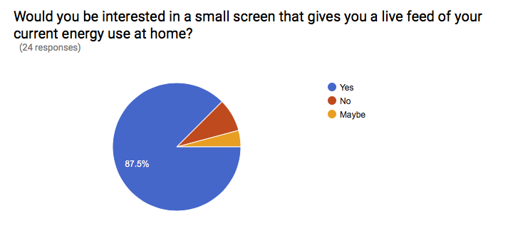
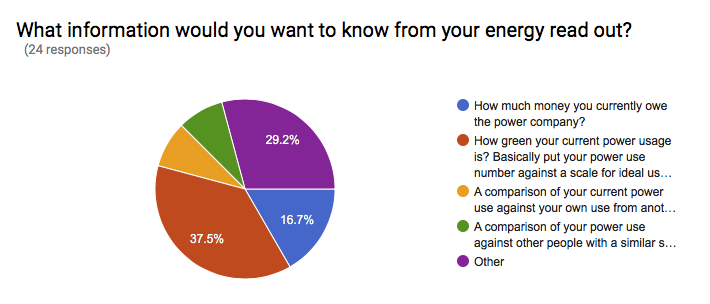
The survey convinced me that I was actually on the right track. The main thing it illuminated was the overwhelming desire to have it as an app as well as a home monitor. Originally I felt the monitor would be the most effective. After all, the Prius screen is directly in front of the driver. Even if the user is not in the mood to check it, she cannot escape from seeing it and therefore being affected by it. When I realized it would definitely be an app too, I locked down on the portrait design to make the two screens identical in functionality.
Since my survey results were mostly people from NYU ITP and friends of mine on Facebook, I was also curious to get feedback from other types of people. The ages skew younger when the respondents are mostly graduate students. And my program is filled with technologists who care about the environment. I needed a bigger test group.
My neighborhood is Inwood at the top of Manhattan next to the Cloisters. The population breakdown is 74% Dominican and heavily families with kids. I decided to paper test neighbors of mine at the local café to see what their interest would be. A very important thing I learned from two married women with kids is to add an option to put in the number of people in the household. It’s not a fair comparison on power usage to compare a two-bedroom household with two occupants verses one with five people living in the same size space.
I found from both the survey and the user research in person most people with kids preferred a screen at home. The younger respondents all wanted the app, but from the survey even those that wanted the app would actually prefer both. Most would be willing to pay something for the product, but all said if it were provided for them by the power company like in the UK it would be ideal. This is my ultimate goal if I could get this product out there. I would want to convince Con Edison to give it to users for free. Or raise money to manufacture and distribute energy readouts to families who could really use it. Everyone I spoke to would love to have one.
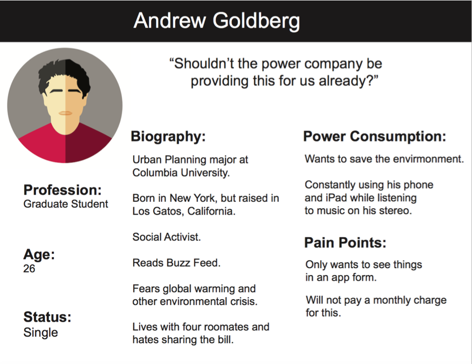
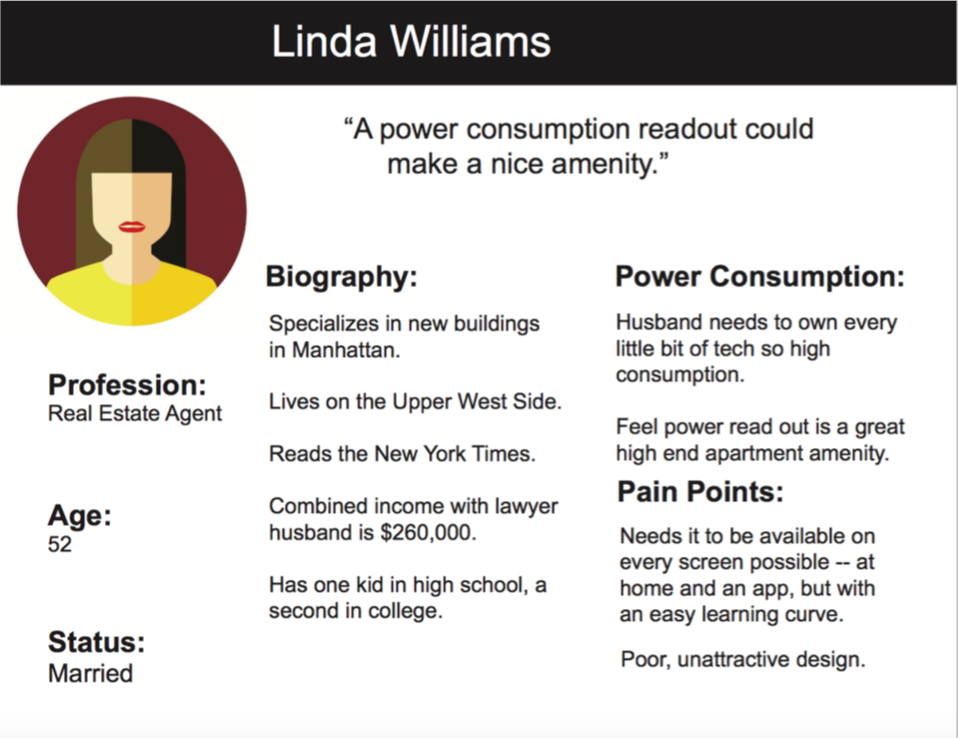
USER PERSONAS
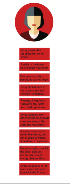
Based on my research, I came up with three user personas. Because all of my user testing was in New York, I based all of my personas on New Yorkers to make sure they were valid. The personals span the main three categories of the target market: environmentally conscious 20-somethings, middle to lower-middle class families with a tight budget and the smart home type market who might see it as an amenity.

ROUND TWO OF SKETCHES/WIREFRAMES

Here is a link to the first wireframe: Prototype
USER FLOW:
USER TESTING

The first thing I realized doing an extensive test on mobile is that it’s impossible to photograph the users while testing when the wireframe is on my phone!
My first test was on my boyfriend – I left out his image because he has to do these endlessly for me! He’s always a very picky user so it’s worth trying everything out on him. Philip felt I needed more than two notches to indicate low, medium and high for the readout. He also thought I needed to say something more like “It’s Peak Hour Now” instead of “Peak Hour Warning” and list the hours it runs at peak beneath the warning when it’s on the screen.
After testing on Philip, I realized that the perfect way to get at least seven more users was a party a friend of mine was throwing. Her guests turned out to be a range of ages and tech savvy so it was a very worthwhile user test session.
User One:
Ian, 27, was able to figure out everything easily. For him, there were no necessary changes.
User Two:
Quest, 39, was able to do the full user test very easily. Like Ian he is in ITP with me so he is tech savvy. He suggested maybe the read out should be in dollars instead of Watts on the home screen.
User Three:
Missy, 50’s, was much less comfortable doing the test. She was a bit nervous, but still managed to figure out most of the icons on her own. Missy only struggled with the picture of the house. She thought that might be the set up. The cog did not work for her.
User Four:
Angela, 31, was not confused by any of the smaller icons, but was unsure about the odometer readout itself. She repeated what Philip needed, a low, medium and high. She also tried to press it — made me wonder if that should serve as the setup button instead of a cog.
User Five:
Nicole, 48, was mostly able to do everything, but she missed the set up. She did not know the cog would be a set up button. Nicole also tried to press the odometer readout, which again makes me think that maybe that should be the set up. She also mentioned maybe an additional set up parameter should be square footage.
User Six:
Chris, 32, found it overall easy, but struggled with the house icon. He felt it should be two houses with a “v” in between. Otherwise he thought it might be the setup button.
User Seven:
Rebecca, 38, was not tech savvy at all. User testing made her nervous. She could not figure out the setup.
User Eight:
Xiwei, 24, pressed the read out to try to do the set up. Did not think to press the cog. Thought the cog line was just duplicating the normal top bar read out of the iPhone. The rest was easy for her.
Conclusions:
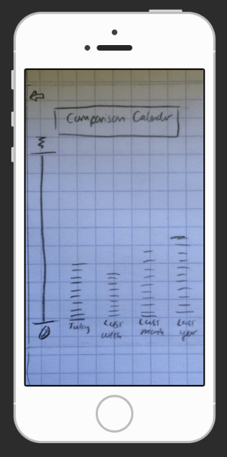
The two biggest takeaways were the cog icon in the top right cannot be used as the set up. Although many apps use it, my user testing made think the readout/odometer in the center should be the set up button. Too many people tried to press it automatically. The second realization was the icon for comparing similar households needs to be a slightly different icon. And lastly, the low, medium and high words need to appear on the readout.
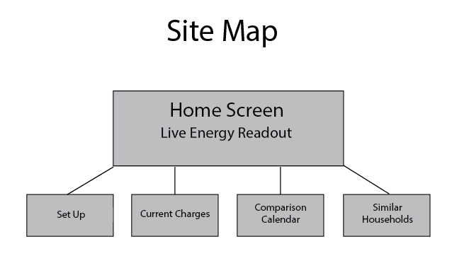
SITE MAP
HI FI WIRE FRAMES
Here is a link to my Hi Fi Wire Frame: Prototype
The biggest changes were to the home page. I made slight tweaks to the other pages based on switching it to a Hi Fi wire frame, but not because of the user testing. Here are the main changes:

IN CONCLUSION:
The user testing on this project was very interesting since I wanted people to be able to operate the app or monitor easily using pictures rather than words. Although I feel it has reached a good place usability-wise, I would like to take more time on the graphic design. But that only speaks to the design aspects of the project.
More importantly I have been thinking about building the product. Smart homes do exist, but a very small portion of the population has one. After talking to quite a few people in my research, I realized everyone would use an energy monitor if it was given to them or if the price were low enough. On a mass scale, it would help save a lot of energy. I saw claims ranging from 10% to 20-30% by putting in a monitor. And for families with tight budgets, it could really help them financially.
The grid has peak moments where power companies struggle. I have been through brownouts in both New York City and Los Angeles. Maybe if the price point were low enough, power companies could be convinced to install energy monitors for customers like the do in the UK. The key is building it at a low enough price point. Another option might be raising money through grants to make the devices and install them for free in middle and lower middle class family homes. Maybe even apply for the green grant at NYU and install them in the dorm rooms. I have a bit more research to do, but I think I could probably build one myself. This would take a lot of work, but it is something I am seriously considering.