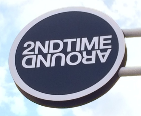
The assignment was to find three terrible examples of signs and one fabulous one. Since I often meditate on loving/kindness and am working towards viewing things in a more positive light, I have decided to start with signs that I like. Two struck me for completely different reasons so I decided to post both of them. The first sign is from a store called 2nd Time Around.
 I love that the sign is clear, concise, and clever. The word “around” being upside down gives the feeling of moving around a circle and makes the sign distinct. I can also read it easily from a distance.
It helps that the store has a great name. The term “thrift store” is not appealing anymore and “vintage” either infers fantastic period piece clothes like 20’s dresses – an absolutely favorite of mine – or things that are used, old and now overpriced. The name of the store along with the modern, hip design makes you feel that the clothes may be used, but they are still in fashion, fun and worth checking out. The design clearly demonstrates the type of store it is. I see no way to improve it.
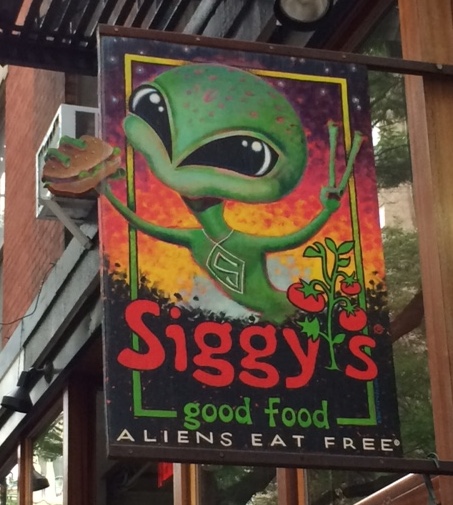 I had to add Siggy’s because it made me smile. I love burger joints and one that serves aliens for free is a must try in my book. The image and text stood out enough that I will definitely be a patron in the near future. And as signs go, I think that’s a darn good result.
But alas I must move on to the not so fabulous signs. The first one is for an establishment that I still do not fully comprehend. They advertise travel, insurance, income tax, immigration, envios and they are also apparently a brokerage firm.

This sign to me is a disaster on every level. The choice of fonts and colors is a varied and disparate as the array of services they provide. “Via Travel” alone is two different fonts. Then “American Airlines” is in their own font, but uses pink and purple instead of their traditional red and blue. The letters beneath are are a tall, tightly kerned font where the additional fonts beneath are thicker, shorter and more widely spaced. The use of pink, purple, red, orange and blue might even be worse than the choice of fonts. This is a most unfortunate sign.
The next example of a not-so-kosher sign I must say is an absolute favorite of mine. It is not good for those who do not have my demented sense of humor and could also cause collisions when drivers read the signs together. I fear their eyes may linger to see if it is actually real and not notice oncoming cars. All of this said, I love these signs. I believe it is the most photographed street sign in New York City.

I must also add one more thing. I live on this block. In fact my actual address is on Seaman Avenue between Dyckman and Cumming. This amuses me on almost a daily basis. I’m afraid I am not above this level of humor.
And my final visually-challenged sign is a Rastafarian clothing story called Babylon Fashion.
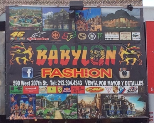
I hate to be this negative, but when I saw this sign for the first time, I thought I might have a seizure. My eyes are drawn at first to the actual name, but quickly they are forced to spread around the insane number of images surrounding it. The effect is overwhelming. And to me this sign could not be less aesthetically pleasing. I understand that I might be a bit less laid back than their usual clientele, but still I feel there must be a better way.
Since Babylon Fashion is far from my style both in color palette and clothing, I felt this would be a good one to redesign. I wanted to include the colors of the Ethiopian flag and the Lion of Judah since it has importance both to the Rastafarian culture and to the brand – they used it three times on the original sign. I felt there must be a way to keep the color, meaning and feeling of the establishment in a sign that is also simpler to read and more aesthetically pleasing. Here is my attempt at a redesign.
 I liked using the bright colors as the background to make it stand out from a distance and scream, “Rastafarian”. I chose a font entitled “The Bold Font” because I felt it would be easy to read and maintained the “all caps” choice of the brand from the original sign. I also decided to have multiple colors peak through both the letters and the image of Judah the Lion. It mades the grid of the sign stand out and gives it a bit more distinction.