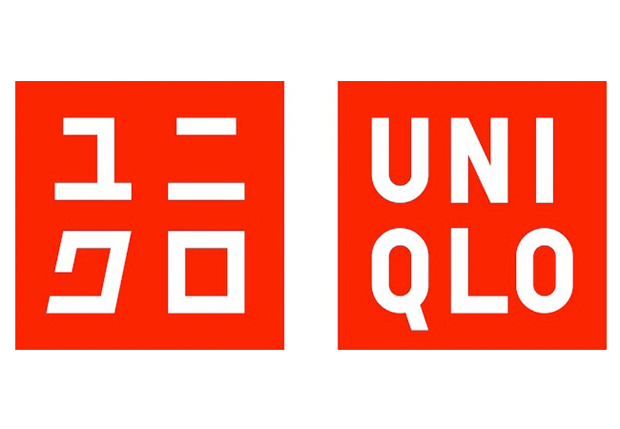
As I was going through the different brand logos, more than one caught my eye. Some are iconic, others all pervasive, but I wanted one that was more recent than the age old stalwarts of good branding. This brought me to Uniqlo.
Since early childhood, I have had a fascination with Japan and China. This interest has grown over the years to encompass everything from the cinema and fashion to the culture and history, but I believe what first drew me to the far east was the aesthetics. And when Kashiwa Sato redesigned the brand logo in 2006, I was his exact target. Instead of Americanizing the brand for the US market, he chose to lean into its Japanese origins.
Uniqlo was originally designed to appeal to young Japanese who loved foreign things. The names is derived from “unique clothing” and the original logo, designed in 1991, was written only in English.
![]()
When Sato began his redesign, the first thing he changed was the color. Instead of the deeper red, he switched to a brighter shade to match the rising sun of the Japanese flag. To continue with this cultural export, he added a second version of the name to sit next to the English letters written in Katakana, a set of characters used in Japan to represent foreign words. And his final touch was to keep the two versions of the name in red squares, imitating the Japanese chops or seals used to sign documents and works of art.
For me, every one of Sato’s choices creates just the effect he desired. That makes it a great brand logo. And since discovering Uniqlo, it has become a staple in my wardrobe.
When I turned my attentions to my own branding, I thought about Sato’s thought process. I am an ideas person more than a fine artist so as I began to sketch out my thoughts – please forgive the middle school level doodles – my ideas flowed more effectively than my pencil.
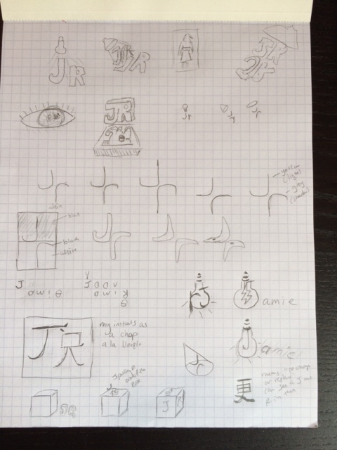
What is my brand? For many years I have been a filmmaker, a writer and a storyteller. My interests span many genres and mediums, but I realize even as I branch out into design, virtual reality, physical computing, artistic coding and animation, certain visual aesthetics continue to figure heavily into my work. Part of my interest in Asian culture is their bold design choices, bright colors, extreme landscapes, and their use of light and shadow. The root of all of these things is contrast. In fact my favorite style of film lighting is film noir, all light and shadow.
Many of my sketches play with lights, mirror images, and positive and negative space. But I also realized that my initials, J and R, can also be written as J and r, sort of reverse mirror images of each other or one as the shadow of the other. What I came up with for now is only a first version, but plays on my ideas for the brand story. The yellow circle presents the pool of light from a spot light set from the top left. The J is in the light and the r is its shadow – not exactly the correct shadow, but close enough. I made them the same color because I didn’t want more than two colors in my logo.
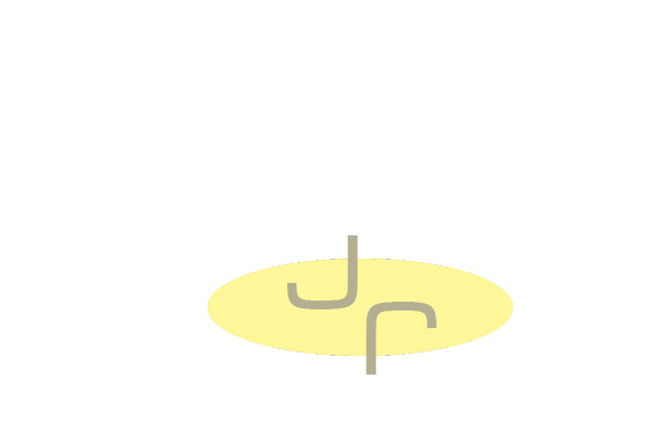
As I go down the list of what makes a successful logo, I am not sure it is ready yet. Is it distinctive enough? Memorable? I don’t think I’ve seen a logo quite like it, but since it’s basically an ellipse and two letters, it is not crazy weird. There is something about the color and simplicity that give me a good feeling looking at it which makes me think it might be memorable. I do think it’s appropriate for the brand, but I’m not one hundred percent sure that I succeeded as well as Sato. Can tell the yellow circle is a pool of light? I do think it delivers on practicality, scalability and adaptability – not that anyone is going to be wearing my initials on a t-shirt or see it painted to the side of a truck or a plane! My biggest fear is that my favorite part of logos is the clever and surprising element. Although I like to think of myself as an ideas person, I’m not sure if the light and shadow are as clever as I would like them to be.