This project was as much an adventure in information architecture as it was in learning Axure! Fortunately both proved to be worth while endeavors.

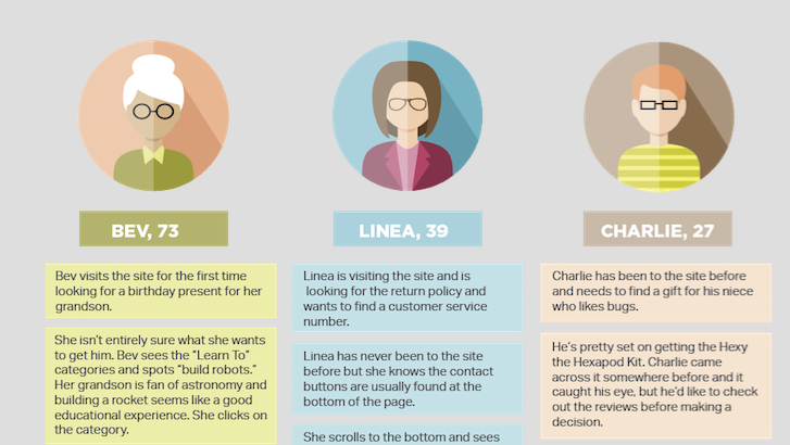
After reading the brief for Little Einstein Toy store, the first order of business was figuring out how to categorize and search the inventory. It is, after all, an information architecture exercise. After reading Don’t Make Me Think and glancing at the User Personas, I knew that not everyone searched a site the same way. We wanted it to be clean and easy to use, but also take different potential users into consideration.
First we started brainstorming user flow. We did not want anything to be too many clicks away, but there needed to be more ways than one to get to a product. It occurred to me that the one factor uniting all of the users was the fact that these are educational toys. The concept of learning runs through to the core of DIY products so I thought a good way to set up the main page would be to categorize the products by topics you learn. All of the verbiage needed to be active and exciting so I came up with six fun categories: Build Robots, Launch Rockets, Tinker with Gears, Create in 3D, Create Pictures & Sounds and Make Circuits. My partners loved the idea so we sketched out a first version of the home page.
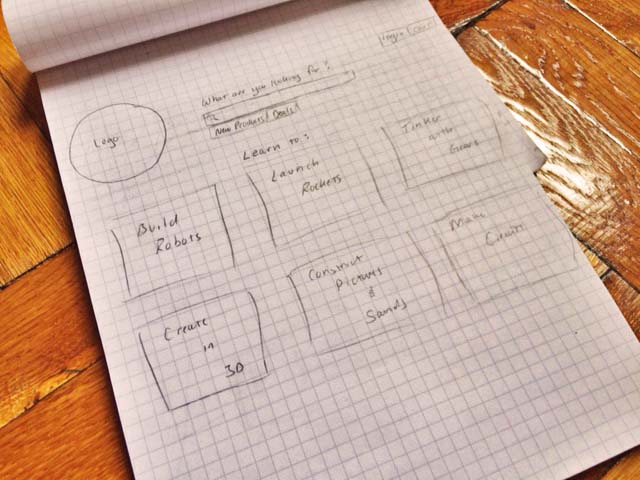
We knew it couldn’t be the only way to search the site, but it was a good way to bring the educational theme visually to the forefront and give customers who might not know what they’re looking for an easier way to search for their options. The fact that some users always simply look for a search bar and Bev — one of the user personas — had trouble seeing it on many sites led us to place it front and center. Then we thought about other ways people might choose to shop, Best Sellers, Deals, New Arrivals (What’s New) and a Product menu that is a little more traditional than the learn to categories. This lead to our site map below.
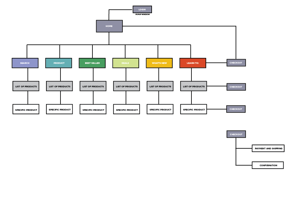
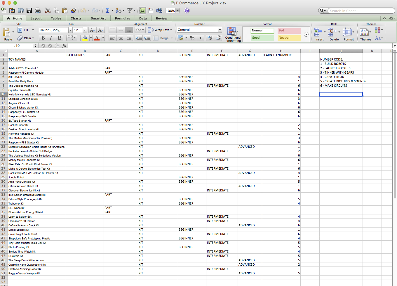
We knew users would definitely want to filter options by difficulty since they could be shopping for different age kids or children who have a lot of previous experience verses new DIYers. We also wanted to make sure the categories we came up with fit neatly into the different search options so we put together an Excel spreadsheet for all of the items that in turn influenced our site map. The product menu search changed after our user test which I’ll explain further later, but this is the spread sheet for the final iteration.
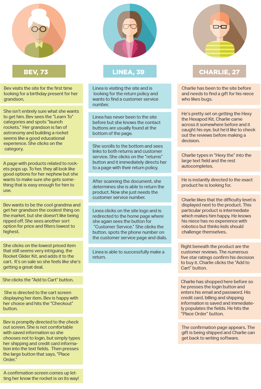
After studying all of the projects and the user personas, we designed the user flows for the three different personas, Bev, Charlie and Linea.
It all seemed to work quite well so we built the first prototype. We made the first two pages together and then divided up the work for the other pages. When we reconvened, put together all of the pages and designed the first clickable prototype. I must admit, in our battle with Axure — not that it was difficult, but we were all pretty knew to it — with neglected the product category. We came up with some general categories for the user test because we wanted to see if it was even a common way to search the site. Here’s the first layout for the product page below:

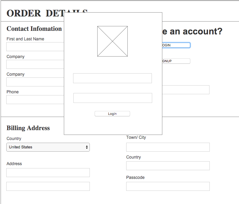
Then we each tested the site on two people each. My first test subject, a 40-year-old Corporate lawyer, loved the Learn to categories, but was very disturbed by the prototype having the billing information already written in. One of our team members had only done this for the prototype, but it still reminded me also of Bev who said she was nervous inputing her personal information. He also found the filtering and sorting categories confusing and reversed as to which should be called sort and which filter. This had been a point of contention within the group so it confirmed to me that it needed to be simplified — simply sorted by price, low to high or high to low, and filtered by difficulty. Another point he brought up was the fact that you can’t put in a search item and hit return. Is there a way to do this in Azure?
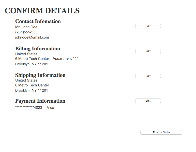
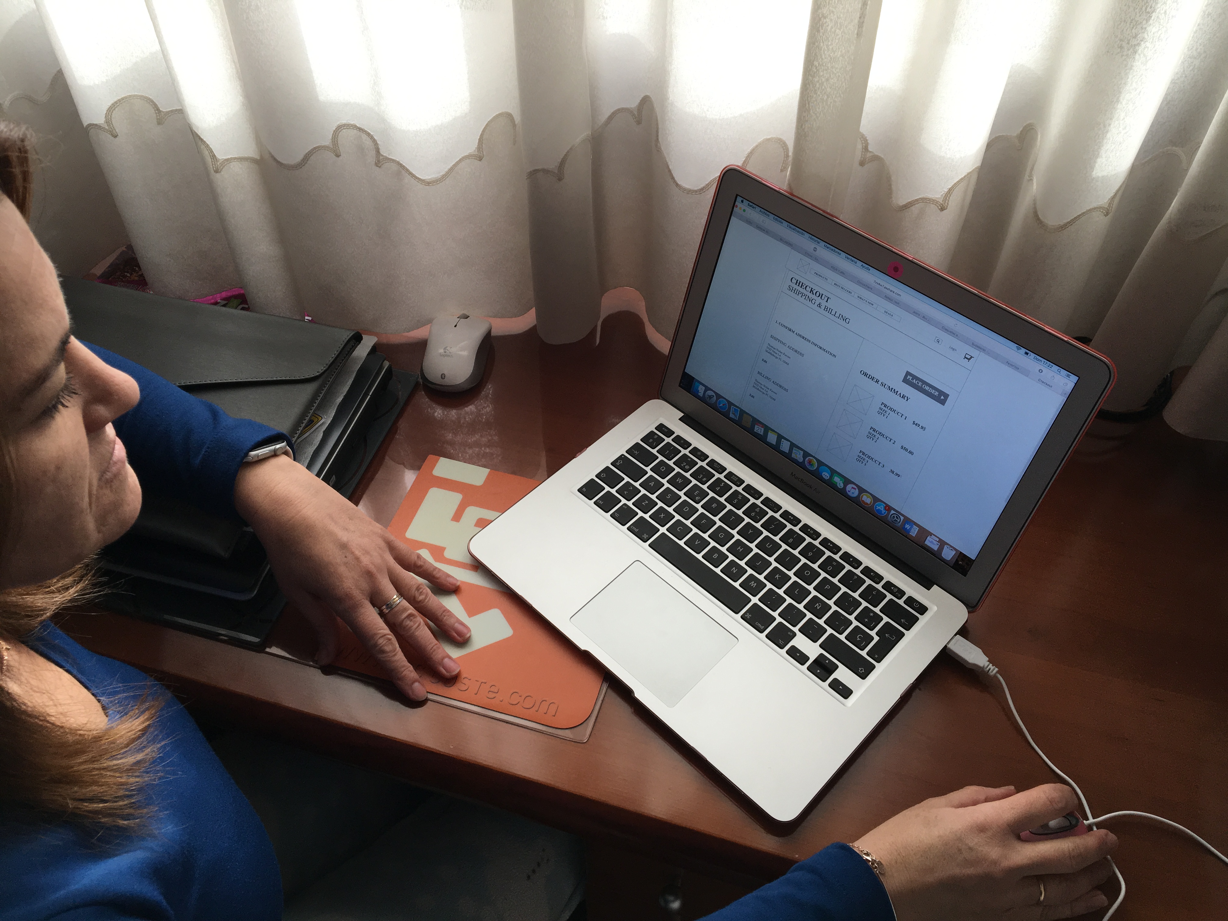
My second test subject, a 46-year-old Content Strategist, had similar problems. He was completely hung up on the check out seems. He felt there needed to be a third page. Basically a cart page, a shipping/payment page and a confirmation page. He also mentioned that it bothered him that there were three products already in his bin when he clicked one — again this was a team member’s choice on the example cart page, but I felt that needed to be changed for any further user testing. He also brought up the weak product groupings if if you searched it that way. I knew that needed to be fixed. And we had made our example category pages — list of products — say the word “Category” as a holder. It would be the category name you searched by for example Best Sellers or Learn to Build Robots.

Kathleen’s test subjects struggled most with the check out pages so when we met up to discuss, I knew these pages would be the ones that needed the biggest changing. Melisa emailed us her results since she couldn’t make the meeting: