UX design this week got a whole lot more interesting. For our next project, we are working with a real client, Hudson River Foundation. We heard directly from the client in class and were able to ask numerous questions clearing up their tastes and needs. Although they are strong with their base — scientists, researchers and activists — they are looking to branch out to a much wider target audience in the community. But how? Ideas were talked about from games to VR. The bottom line however is they are a non-profit organization. This is a chance to get work on the site for real and therefor that work needs to be buildable within their budget, not simply pie in the sky.
The company hired a firm to design their website, but that aspect even seems somewhat up for grabs. They are in the early stages of merging two companies, the Hudson River Foundation with the Estuary Program. Everything will be changed from their logo and color palette to a new build for the website. The materials sent from the other firm gave us a good starting place, but we knew we were free to come up with alternate options that might suit their needs better.
My group met briefly in class. We all agreed on general directions, but felt a lot more research was needed before we made any larger decisions. We all went home to read through all the materials provided to get to know the companies better and look at other successful sites we liked for similar organizations.
Our conversations from class quickly merged with the research and flowed quite well when we met up again. We all wanted a landing page that would bring in a wider target of users. It would need to be interactive, fun, informative and diverse. In class Aurora brought up a game where you could be a fish, a bird or some sort of land animal, three views which we all thought was an interesting idea. This made me think maybe it should be only two mirroring the quote, “One if by land, two if by sea.” Of course there would need to be a navigation bar that allowed scientists and researchers to easily navigate if they knew exactly what they wanted ahead of time, but how could we make this interactive part interesting without making it too hard to build? Eshan brought up parallax sites. The first example that really caught our eye was www.dangersoffracking.com. They did a fantastic job of telling the story!

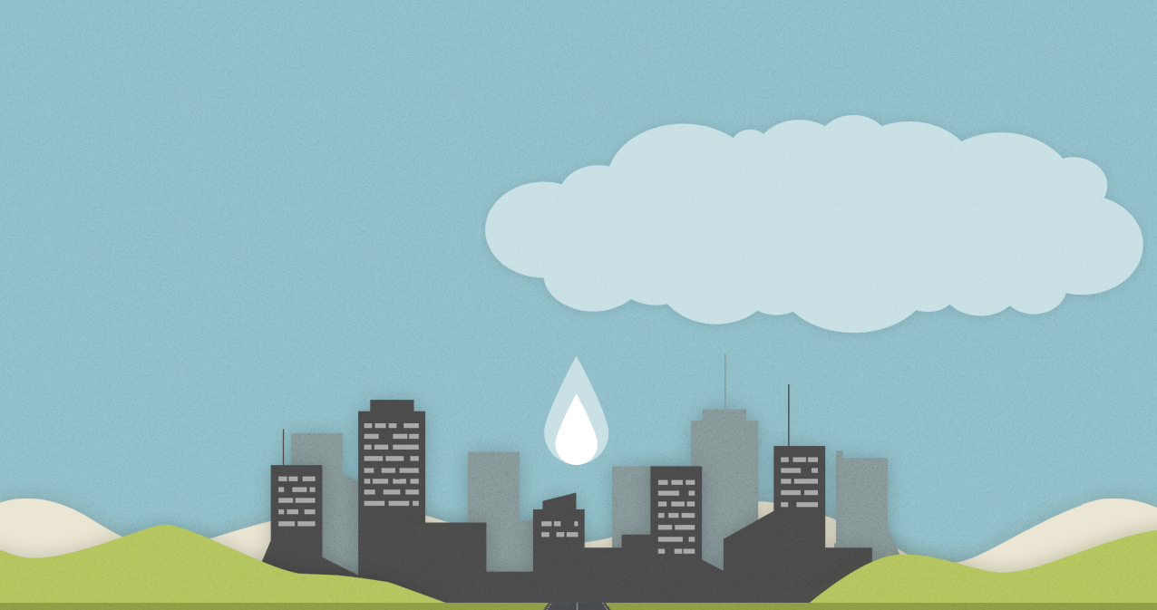

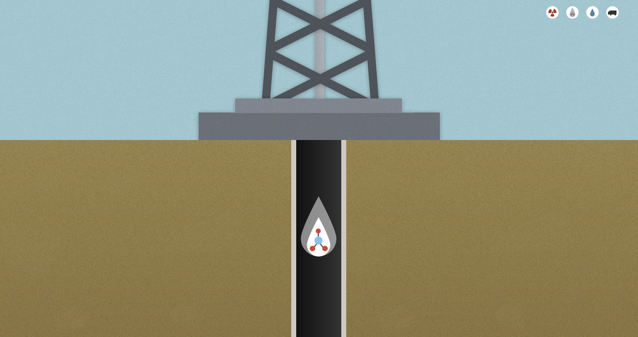
The site follows a drop of water through the fracking process. It was very fun to interact with and extremely informative. As you scroll down the page, the drop stays with you through different scenes illustrating its story through the process. We also found a few other sites that used parallax that were great as well. One for Highway One and another about credit unions. We learned that the scroll could go down or across, but we were not sure how to do it for our site.
I had been thinking a lot about the history of the Hudson River and how it’s changed over time. So many interesting visuals would change and the story arcs. Before settlers came to New York, nature was at its finest point both plant wise and through the animal species. Over time both these things declined from the oysters disappearing to Manhattan rising as a nearly all cement metropolis. But as the Hudson River and Estuary Foundation groups formed, some restoration and the return of species did happen giving a little arc and a glimmer of hope that you can make a difference a the end. I felt this slight change from a complete decline to something more positive was important. In order to have a call to action, the user needs to feel that they can make a difference. Then it occurred to me how we could do this.
We could switch point of views as we scroll and use the water line to jump time!
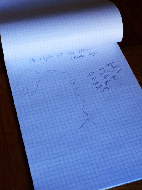
The Point of View is a heron. According to the literature given to us, it is one of the most beautiful birds that exists above and below the water line. Since heron eat fish, this perspective would allow us to see below the waterline. For the landing page, you start with the heron at the top of the Hudson river and fly down towards Manhattan. Since to start, the birds flight would be up high, the view would mirror the newly designed logo as it slowly flew down to Manhattan.
During this trip we would see nature in all its glory — all that exists in the habitats native to the Hudson River Valley and eventually the estuaries. And in case this is unclear, parallax is driven by the scroll option so scrolling is what moves the bird down the page very similarly to the drop of water.
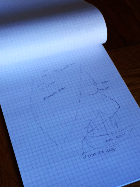
The bird would fly down the the island of Manhattan where we would see the Dutch first arriving. This is the beginning of our time line, 1608. The bird flies over the ship and dives down into the water searching for a fish. Again the scroll downward would move us below the water line.
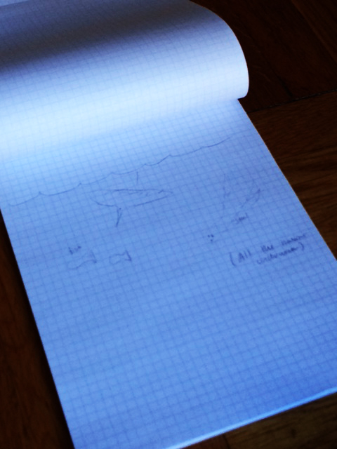
Once we get beneath the water, we would see all the natural habitat in the river. The fish, oysters, eel grass — everything that naturally existed in the habitat.
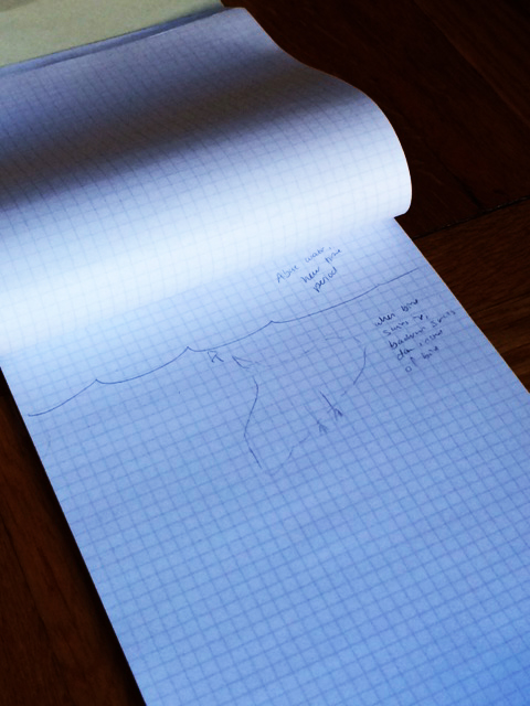
Then this is where I came up with a good way to use the parallax. When the bird moves upwards, suddenly the background is the part that moves down connected to the scroll and the bird — who is now visually pointed up — stands still. With the background moving, it gives the bird the illusion of flying upwards.
Everyone agreed on this idea. We can use each drop above or below the water line to jump time on the timeline. As different wildlife disappears and big New York events occur, we can witness the changes. The visuals will all have links attached in case the user has a particular interest in one species or activity. This would allow the customization needed for the diverse content the foundation was looking for while uniting the process in one fun interaction.
The final stage of our meeting led to us breaking down the next deliverables we would need to finish. We each have our assignments and found the group worked quite well together.
FINAL THOUGHTS FOR THE WEEK:
The more I delve into UX design, the more I enjoy the cross section between creativity, client needs, user needs and psychology. Our research of the information architecture drove a lot of the brainstorming, but so did looking at other sites and considering how to connect disparate subjects in a single fun, interactive way.
The brainstorming as a group was also very productive. Each of us built on the last one’s idea which led to a very fruitful meeting. As one person proposed something we liked, another would add to it and take it to the next level. This I know is fortunate and cannot always be relied upon, but I spent this week relishing how fun it is when it happens.