This assignment terrified me a bit. I have been thinking about how to brand myself during and post ITP for a while now. My background as a writer, filmmaker and director still earns me money and my years spent on it should not be tossed out, but I came to ITP to expand my skill set and it would be criminal not to include this in my new brand.
The logo I had designed for the last class never satisfied me. I felt I settled on it when I ran out of time, but I did stumble upon the base of something. I started with the idea of light and shadow. The image that stuck out the most to me was how my initials could be mirror images of each other. Although a true shadow would not mirror it so perfectly, the symmetry appealed to me more than making the concept representation completely realistic.

The yellow color I played with to reflect the light source never worked for me. Different colors appeal to me for different projects, but I could never see committing my brand to a single color so I changed my logo design to black and white. On black and white film, this could be light and shadow and for other interests of mine like virtual reality, it could reflect the real world and the mirrored virtual world. I also have really enjoyed design and would like to continue to explore it. A bolder logo felt more like it represented a designer than the wishy washy image above. That is when I came up with this new logo for me. And it quickly led to the design of one side of my business card. I prefer it immensely to the original version above.

The flip side took a little bit longer. As I filmmaker, I am very comfortable with the composition of images. The first side of the card does technically have to characters on it, but I felt it was more image than text. The writer in me sees text in either screenplay format or prose, but rarely have I focused on the visual composition of the words on the page. To figure this out, I tried drawing out many different versions of the card – including different takes on the logo above to make the text side stronger.

Then I decided to put it into Illustrator – after many more tutorials, I was ready to really use it and I must add, I did not go back to photoshop! Design wise, it would be easier to make the decision after I printed out versions and took a look at them as real cards.
Quickly I saw that the new logo design and the back of the card I showed above truly worked, but my layout of the text was lacking. I chose at first black on white to be simple next to the boldness of the other side, but it didn’t work. The text side did not truly reflect the concept or the design of the logo side. I think the card below is awful. The only thing I did like was the font I chose, Poiret One, but the kerning and relative font size needed to change for that as well.

I immediately realized the text side needed to be half black and half white as well. I feared it would be too busy, but I was wrong. It was much stronger. That solved one problem, but not the layout of the text. I chatted with a designer friend who gave me different ways to think about working with text. I also thought about our discussions on text as image and finally came to a design I feel pretty good about. Below is the final design of the front and back of the card.
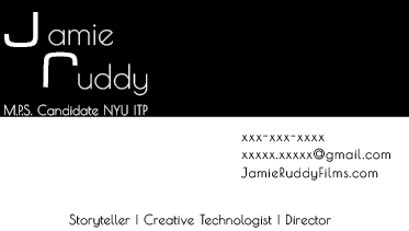
I created negative space in the bottom left and top right to add to the checkerboard effect. I also remembered our eyes go from top left to bottom right so that was the best place to write the information. I also didn’t want the text to overwhelm the person receiving the card, but to better explain who I am and what I have to offer, I needed more text than I would have liked aesthetically speaking. Both the MPS Candidate line and the skills on the bottom create lines on the page that mirror the divide. And the weight and location of my name with the graduate degree in the upper left anchored and mirrored my contact information on the lower right. I also changed the kerning of the letters, spacing them out much more. It allowed me to make the text both smaller and more legible.
I direct a lot of branded content so I changed the word “filmmaker” to “director.” “Creative technologist” encompasses all of my new interests at ITP and although it is my newest and least developed skill set, the words were the longest so I put them in the center. I’ve also been a writer for many years, but storytelling in interactive mediums is in demand more than prose or screenwriting or even directing so I decided to lead with storyteller instead of director.
I think I might actually make this my new business card!