This week I spent some time emailing back and forth with Andrew Milmoe at GE Digital. He gave me options of things to use for my UX project. The project I found that might be most useful was a system that turns data streams from all over the world into a singular measurement system to be easily consumed by a monitor at a remote location. It also took 5000 streams of data and filtered it into 200-300 most important tags to be translated into the same measurement and passed along.
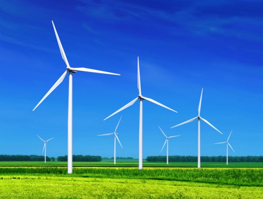
The example Andrew used was Wind Turbines. Each turbine is slightly different based on its make and where in the world it is installed, but the information gathered from each turbine has to be streamlined globally into a singular tagged system to be used on the Industrial Internet at GE. This was a very fascinating email exchange, but I found between the industrial nature of the project and the fact that much of the information would be inaccessible because its proprietary for GE made it hard for this to be used for my UX project. How could I test and iterate without a fuller understanding of what was needed and without a test group of end users?
Meanwhile in Energy class, we were talking about our energy measurement projects. Although Joakim and I did our numbers based on our water filtration project, others did theirs on personal power consumption. It got me thinking about what I’ll call The Prius Effect.
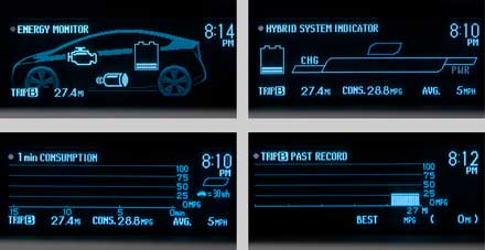
Before I had a Prius, I was a zippy driver. I liked to get places fast. I liked to feel the speed of my driving. I loved the winding pass on Sunset when I lived in LA. BUT the moment I got the Prius, it all chained. The Prius game is very addictive. Once I could see the read out from when my car was in electric to gas mode and simultaneously saw the current MPG of the car, my driving change. Suddenly I was slowly rolling to a stop at red lights. And taking my time in electric mode instead of racing off the line. It changed my driving methods over night and made my actions — in addition to the more fuel efficient engine — use less gas.
When I was in class it made me think that a similar readout for our homes and businesses would make a difference. Turns out they already exist, but very, very few people have them. On the other hand, in the UK, the monitor comes from the power company. My significant other is British and his sister was joking about how much its changed her behavior at home. I got Nicky to send me photographs and the user guide to her monitor.

I also began to research the current monitors in the U.S. There are some in existence, but I do not know anybody who has one. This has become my newest UX design project. I’m determined to figure out the best design for a monitor that would make the most difference. I’m also curious if it is something we can get the US energy companies to adopt instead of forcing consumers to purchase them on their own. With the stress on the grid, I felt it might be in the best interest for energy companies here to install them, but either way the design would need to be strong enough to keep the cost down of the project so that it is viable.
To start with I have sent out a survey to potential users to see if this interests them and if so what would they be looking for in a monitor. I have also been working on the competitive analysis. It’s made me wonder why I have not heard of these companies and why I know nobody that uses their products. I’m taking a look at their price, how they work and the type of information they relay. I am also talking to Nicky, the lovely sister of my significant other, taking apart the strengths and weaknesses of he monitor. She says it has definitely changed her energy use.