I was always struck by the visual style of the 2006 animated film, RENAISSANCE, directed by Christian Volckman. The poster shares the same incredible imagery with the film itself.
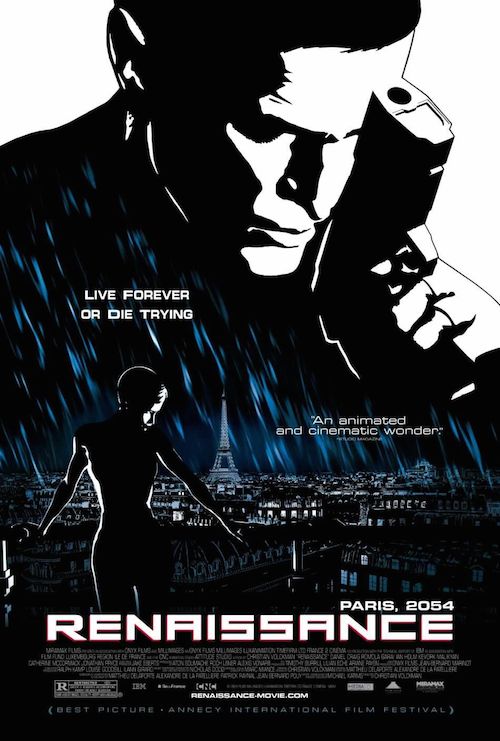
The entire base of the style uses negative space to tell the story. The characters are only seen in black and white, light and shadow. The details of their faces are very hazy and yet the emotion comes through. This can be seen both in the larger than life lead character in the top right, emotional and yet pictured in only simplistic black and white. The same style is used for the supporting female character, her face pointed in the same direction and angle towards the light as the lead above.

When I drew the grid over the image the design became clear. The characters and setting are both told in the largest boxes. The top one introduces the lead. The middle box introduces the leading lady and the location, Paris. Similar to the rule of thirds in cinema, the gun and the leading lady are both placed nearly one third from each side. Also the thirds intersects three of the important prose positions on the poster. The horizontal grid also neatly separates the different sections of text across the poster. As busy as the image is, the placement neatens up the layout of the page.
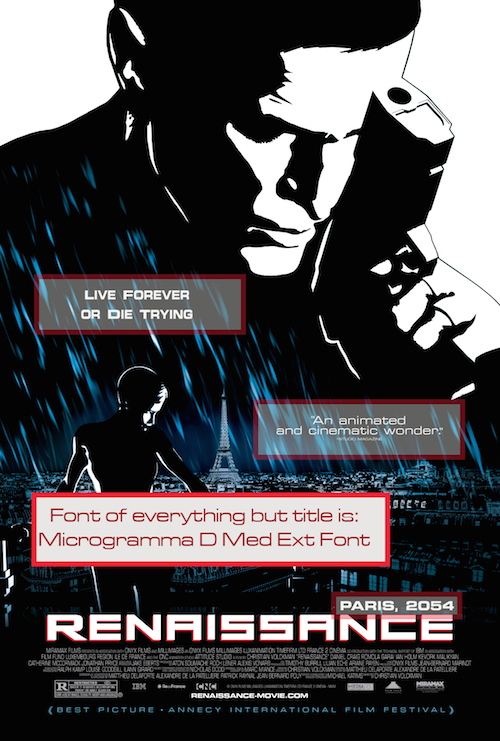
The hierarchy of the page is based on both size and font type. Most of the poster is in the font, Microgramma D Med Ext. The only exception is the title. I was not able to find an exact match, but I believe it is a custom font based on Microgramma with a few changes to make the letters stand out even bolder than the other text on the poster – I see the changes in the A’s and S’s in the word “renaissance”. Both fonts appear to be in the same family. And the choice of such a clear, bold font, used in all caps for the most important pieces of writing, plays into the science fiction genre of the film.
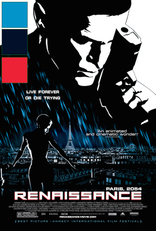
One of the most interesting aspects of the film and poster is its use of color. The world is told in black and white, but uses color here and there for emphasis. The light blue is used to somber the mood, bringing Paris in the rain more to life. The darker blue enhances the lighter in further painting the scene and helping it blend into the background behind the lead character and the title. Then the red reminds the audience of the film noir aspects of the narrative and gives the title a little more punch against the rest of the poster.