This week’s assignment was to design a book cover. Although I haven’t had to time to edit my novel, I had to take a crack at my own. China: Kingdom at the Center of the World is speculative fiction set in 1854 China. The look of the world is far from what I would consider suited for generative design, but maybe the limitations could produce something unexpected? This is what I created:
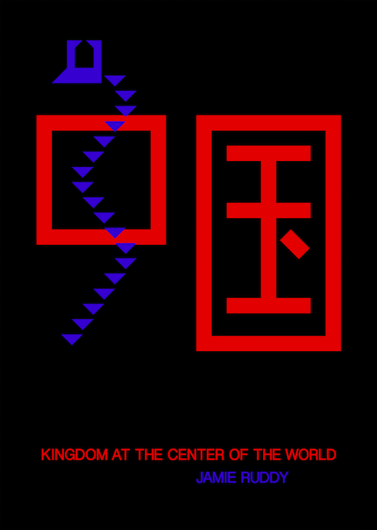
Instead of an epic, rice paper painting, I felt inspired by a minimalist look. And although cubist work is usually a lot busier than this design, I felt that everything within the book cover would be made out of simple shapes instead of curved brush strokes. The final product is an interesting first attempt and made me think twice about my original conceptions of what this book cover would look like. Although the blue glows somewhat brightly on the screen, it definitely has contrast issues against the black when it’s printed. If I do stick with this design, my next step would be the try different lighter, but neutral background colors — shades of grey or off white. Maybe at least the color of rice paper would work even without the aesthetic?