I would say the number one surprising thing that occurred to me this week about UX Design is the importance of research and analysis. Before now, I understood everything was based on testing and iteration, but the artist in me still felt the initial ideas were more or less creative. Not to say UX is not creative at all, but I was mistaken. Although there were design ideas we had from the first week that were based on the client’s notes — and we’re probably keeping — I didn’t realize how much more the user research, competitive analysis and comparative analysis would come into play with the initial design.
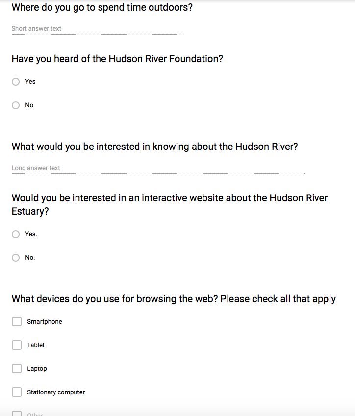
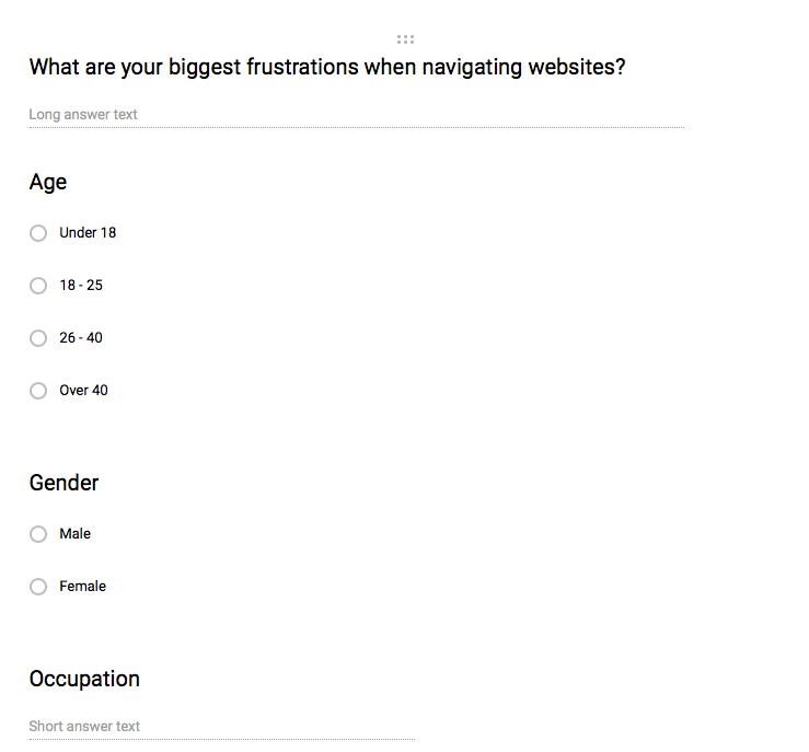
Aurora, Eshan, Rahul and I realized immediately that we needed to do more research for the Hudson River Foundation before we could move forward on any of the deliverables. We quickly did some Googling and designed a survey we felt covered the most important issues we needed to learn about — we really needed to know what the new target market might want and need. The client was also more concerned with expanding their visitor base than serving the ones who already spend time on the site — this also meant a survey to the new, wider target would be even more important than finding out more about current users. And we needed to get it done fast. Hence our fabulous Google survey.

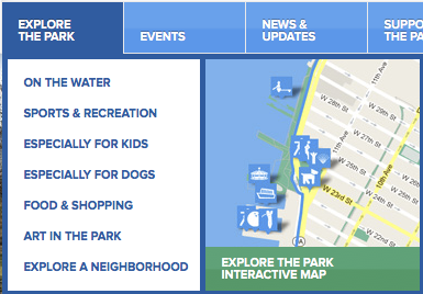
While waiting on the results, we moved on to competitive and comparative analysis. Hudson River Park– hudsonriverpark.org — actually almost fit both categories. Although the aesthetics of the site are not particularly inspiring, the UX is very good. Hudson River Park serves fewer scientists and activists, but it’s main target is the market the Hudson River Foundation is looking to expand towards. And the navigation is very intuitive and easy.
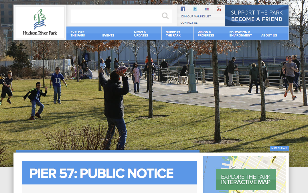
Each of those nav bar headings opens up into a drop down menu.
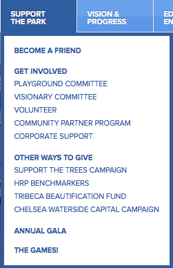
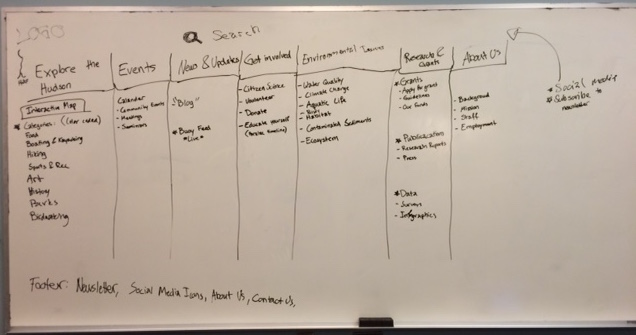
The categories were clear and easy to find. It helped us think about our own information architecture. We decided to start to build the categories for our project. The Hudson River Foundation wants to cover a wide range of topics that interest an even wider range of people. The IA of the site would be crucial so we spent quite a bit of time working on the first iteration. This is a sketch of our results:
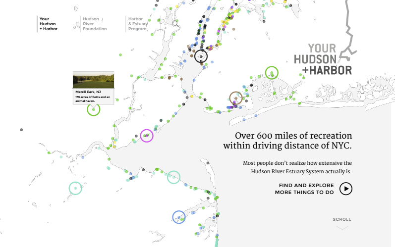
We also noticed an interactive map on the Hudson River Organization’s site. Although they are covering a much smaller region, it was interesting to see that they connected it to a drop down menu. The rest of the navigation with the map worked better for their site than it would for ours, but we found it inspiring.
The web designers had proposed a map of the area covered in little colored dots. Color coordination is a great way to make a large amount of information more easily categorizable. I thought if we could have each category in the “Explore the Hudson” drop down menu have a specific color assignment, the map could sort by the type of activity/color. So the initial map that pops up like the one above would have all of the rainbow colored dots. Here’s the map from the folder given to us as a first draft:
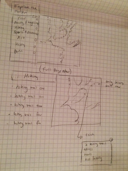
Each color corresponds to a certain type of activity. As the user chooses an activity, only one color would remain — the locations pertaining to only the activity. Then the user could click specific dots based on a convenient location to find out the name, address, hours and other details like if the activity is kid friendly. Here’s a little sketch of the user process:
I found this process less creative as a designer, but great for UX Design. Before we find a way to make it beautiful, we first want it to be easy to use!
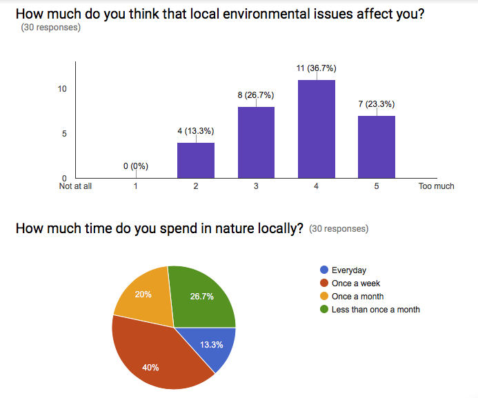
Meanwhile we have been collecting responses to the survey. I believe we are already up to 30 responses. That is not exactly the largest pool for statistics ever, but it is substantial enough to begin to put together user personas. Here’s a few charts based on two of the questions:
We decided we would do our first user testing based on our current work using both the Hudson River Organization website to see how users respond to it and our first paper prototypes of our ideas for the new website for Hudson River Foundation. The results will affect the next iteration of our design.