
SUBWAY MATE
PROBLEM:
My partner, Sicong, lives in New Jersey. She commutes into New York often, but not often enough to buy unlimited metrocards. Sicong has trouble remembering if she has money left on her card and often ends up at entrances to the subway that do not have MTA machines. Since Sicong is from China, she does not know New York well and often Googles for the nearest subway station. Unfortunately, Google does not let you know which entrances have MTA machines. She needs a way to find the entrances with the option to refill her card.
SOLUTION:
Build an app for her phone that lets her know all of the close by subway entrances including the information of whether or not they have MTA machines. This is definitely possible, but after spending over an hour on the phone with the MTA after exhausting their website for the information, the research aspect is difficult. The worst-case scenario would be to travel to every single subway stop and find out for myself. Or stay on the phone with the MTA until I find someone willing to help me. Since the former is possible, I know the information for this app is possible to acquire, but it would be expensive to build based on the amount of research it would take. The other part involves using the Google API/maps. Therefore, I do believe my solution would be buildable.
Since the solution is possible albeit difficult and I believe really helpful to the user, I moved forward with the design assuming I would be able to put together this information for the entire city if I were to build the app for real.
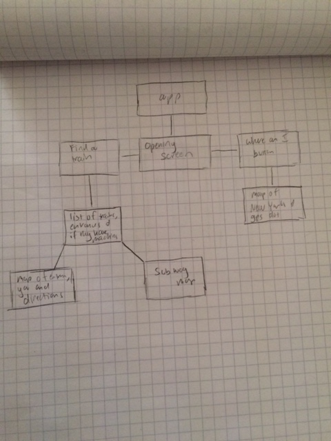
ROUGH USER WORKFLOW:
Please excuse my handwriting. As I pursue UX Design, improving my penmanship is number one one my list.
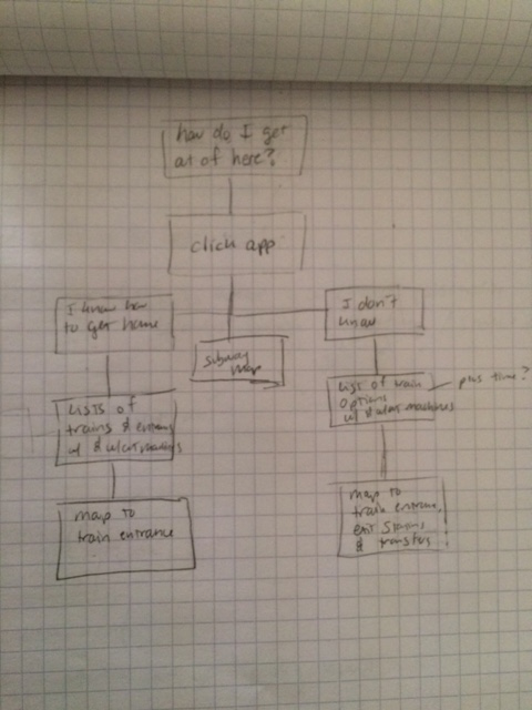
These were my first thoughts of how to use the app.
I also looked at similar apps including City Mapper, Uber and Gas Buddy to see what I liked and didn’t like about their design. My favorite design was Gas Buddy by far. The simplicity of the app made me very, very happy as a user. Sicong needs a subway and needs it NOW. She doesn’t want to wade through endless buttons.
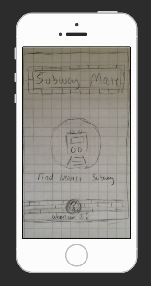
FIRST PAPER PROTOTYPE:
I needed to start putting my thoughts on paper to both sort them out and to user test the ideas.
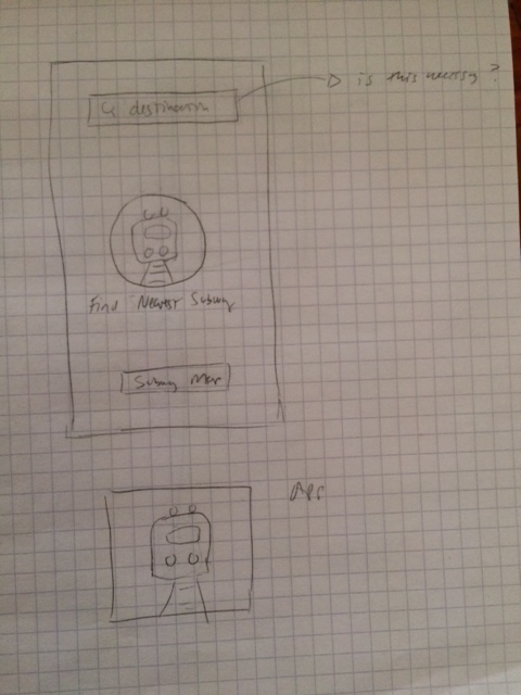
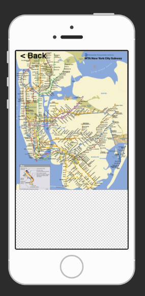
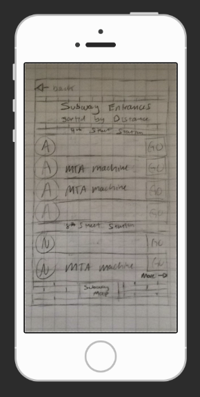
I made up a cute icon for the app and then drew the opening page. There is one large button in the center that says, “Find Nearest Subway” with a large icon of a train. Up top is a search box that says “destination”. And at the buttom is a link for the subway map. If you click into the train, it gives a list of train entrances and lets you know the trains at that station and whether or not the entrance has an MTA machine. The entrances are listed in order of distance from your current location. If you click on the specific train, the screen it takes you to is a map Google style. It shows you where you are now and where the subway entrance is along with a route to get there.
If you type in a destination, it takes you to a very similar screen to the first one, but it lists the train along with the line you need to transfer to in order to reach your destination in addition to whether or not it has an MTA machine. If you click on the choice, it takes you once again to a map. I also never quite solved where to put in the transfer station information on this one. My fear was it might be over kill for this app. Her problem was finding a station with a machine, not directions home.
FIRST USER TESTING:
USER ONE:
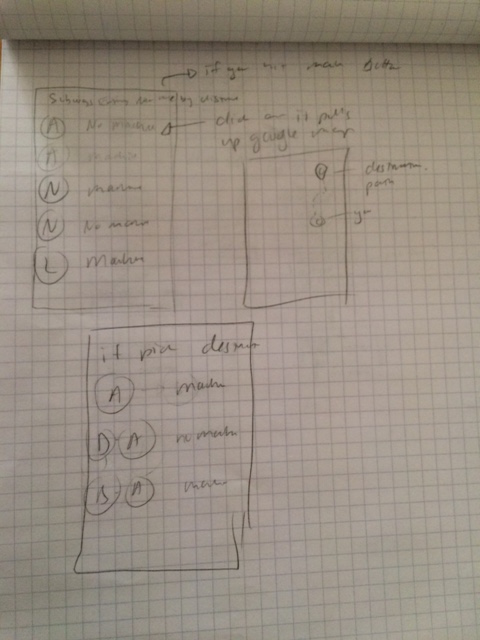
Subway map button is too big on the opening page. Felt it would be more useful on the second page – after you have pressed the button, “Find Nearest Subway”. He wanted to know potential transfers after he knew what trains were near.
He felt he wanted to see all of the entrances to the nearest train on the map screen in addition to the one he was going to. He thought the one he was headed to should be highlighted, but all of the options should be on the map.
Wanted to know the time if he typed in a destination. How long will it take to get there using this route?
USER TWO:
Did not like the search bar on top of the first screen. Loved the main button and the design, but felt the search button added too many options for him. He was a bit older and finds himself often overwhelmed by apps and sites. Since Sicong would often be using this in a rush, it would also be good for her to be as clear as possible. He preferred fewer options in general.
Overall he found it pretty intuitive, but he had no interest in the directions part of it and was less clear on how that part played out. This made me think I should illuminate it — after all it was not part of Sicong’s initial problem.
I asked if he would prefer the subway map on the second screen like the first user out of curiosity – it seemed more intuitive to me to put it there. He liked that.
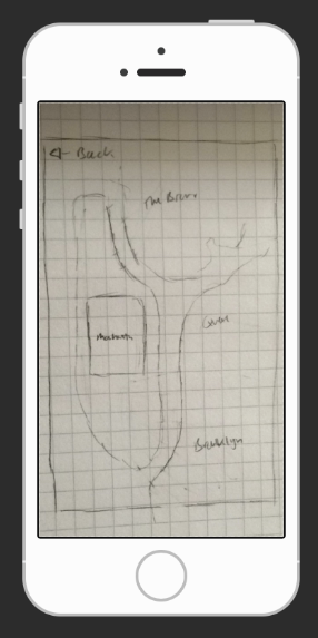
Finally I noticed for myself and for my users that I wanted the app to be as simple as possible. I also heard in my head the who, what, why, where and how questions. If I don’t know a city well, my big question would be, “Where am I?” I told him I was thinking of replacing the subway button with the “Where am I?” button on the first screen and he loved it. That way the user if necessary can always get her bearings first if she wants to before she searches for a train. The button would pull up a map of the whole city (again pulling from Google) with the gps showing where you are. You can zoom in, but it would be a wide view to lend you some perspective of where you actually are within the whole of New York. Of course you could zoom in as well, but I see it more like the national park maps we discussed in class.
Based on the user testing, I built a slightly enhanced work flow for the user.
POP DESIGN ONE:
I incorporated all of the changes, drew each page adding details and the design improvements based on the testing and put together my first interactive POP prototype.


USER ONE:
The first test turned out to be very successful! The only feature that stuck out to the user was the fact that on the screen with the train entrance list, he wanted to know what the name of each station was.
POP DESIGN TWO:
The user recommended I put it where the words MTA Machine were at first, but that would take away the primary goal of the app – to let you know which stations have MTA machines. So instead I grouped the stations together and added a band above each group saying each station the entrances were associated with. I showed him the new iteration and he felt it solved his problem.
OLD: NEW:
FINAL THOUGHTS:
I truly enjoyed the process. Since I was not at school for the latter POP prototyping, I regret not having as many users as I would have liked, but I definitely got a feel for the process. This is a field I am definitely interested in pursuing. Now if I can only improve those handwriting skills!