For this assignment, we were supposed to do a design that captured the feeling of tension depending on the color palette chosen. On certain color choices, the design should succeed where with other colors the design would fail. Since Rune mentioned those of us with exacting designs should try to be more experimental, I took it to heart. My first designs were using sin functions with circles to create springs. My second was to create a wall of eyes. First perfectly spaced and then I tried random positioning. These things were both strong conceptually with the concept of tension, but the colors did not make as big an impact on whether or not the design was tense.
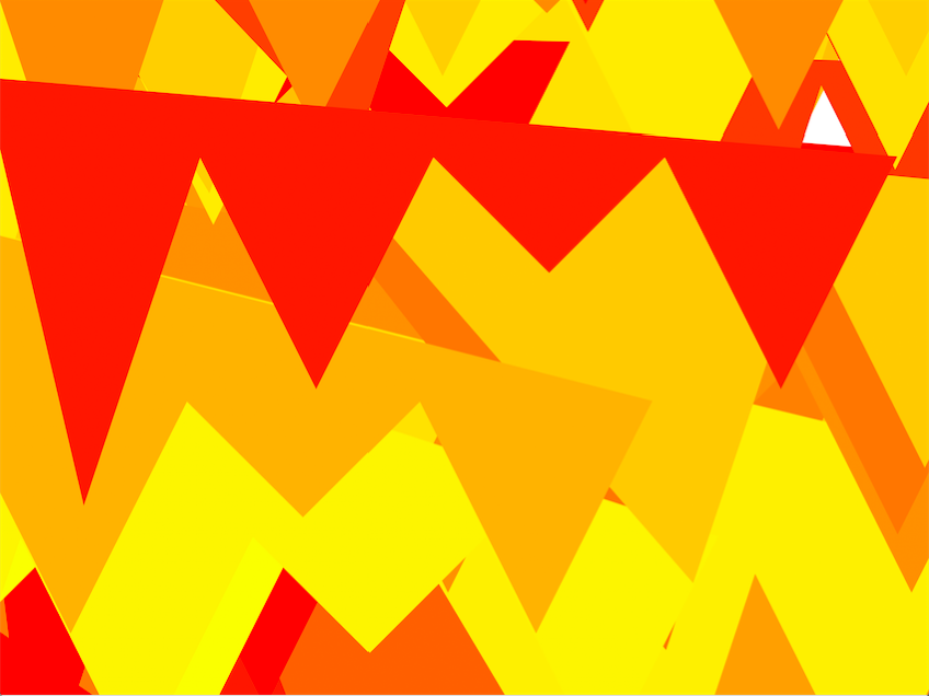
The above fit my abstract concept of tension. I imagined all of these jagged lines fighting with themselves. I first tried it without fill, but it didn’t work for me. Then I played with the fill rules and eventually settled on the design above. By picking a specific range of random colors, but keeping it in the analogous range to red, it created this intense image above.
Since the design was random, my none tense version is not exactly the same, but I saw a huge difference in the tension it inspires.
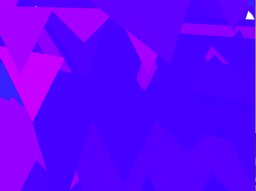
I also proved to myself the rule we were talking about in class. Although I gave these two version the same number range of colors, the red/yellow/orange version looks so much more drastically different then the same number range of blues and violets. It really is an interesting phenomenon.
Originally I made this with the code below. The colors change by changing the range in the hue variable.