
Your Hudson + Harbor is a new non-profit organization birthed from the merger of the Hudson River Foundation and the Harbor Estuary Program. Together the two NGOs focus on developing scientific research, providing leadership, integrating and disseminating information and coordinating efforts to solve complex environmental issues facing the Hudson River and Estuary. The combined forces of these two formidable groups requires a creative way to organize a lot of information into a simple, usable website.
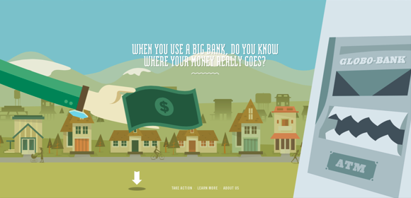
The client desired above all else an interactive landing page that would allow many different types of users to find their personal connection to the Hudson River and Estuary. Whether finding a fabulous kayaking spot or joining a citizen scientist group, a conversion for Your Hudson + Harbor is getting a new user to connect with the river and find a way to make it his or her own. This requires a lot of different types of information to be united into a singular form. Ideas were tossed around ranging from building a Hudson River video game to creating a virtual reality film using 360 footage already shot by Google. Both options were exciting, but neither felt like a perfect way to bring in a diverse group of new users. We decided to instead build a parallax landing page.
A parallax website has the amazing ability to feel like both an animated film and a game. It also allows unlimited links to additional information and outside groups – an aspect required by the sheer volume of topics covered by Your Hudson + Harbor. We also needed a clear and concise organization for the site accessible through a navigation bar allowing current users and newcomers — who do not have the time to enjoy the parallax experience — to find their information quickly and easily. After a long research process, we feel confident that our choices would work for the desired results.
Target Audience: Attract and convert new users of all shapes and sizes.
List of Desired Features:
- Interactive landing page that organically houses links to the full range of topics covered by the organization.
- Easy navigation for current users
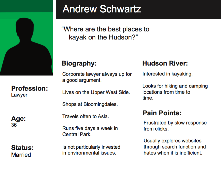
- A well-structured information architecture allowing each subject to have its own place without influencing another option. For example not placing fun places to kayak next to upsetting information on PCB levels in the water. Both fulfill different important informational needs, but one might discourage another option — not a desired result.
- Find a way to keep the website and large volume of data visual for the user.
Our group felt confident in our initial ideas, but research means everything in the UX design process. In order to deliver a quality product we would need to learn more about both our target market’s desires and how they would interact with our content. We started the process with a survey focusing on the awareness of the brand, interests in the materials the organization could provide and the users’ pain points when navigating websites.
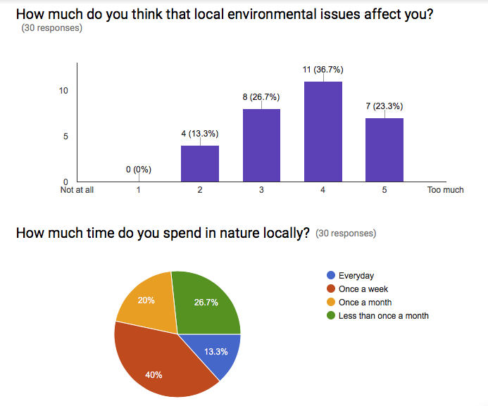
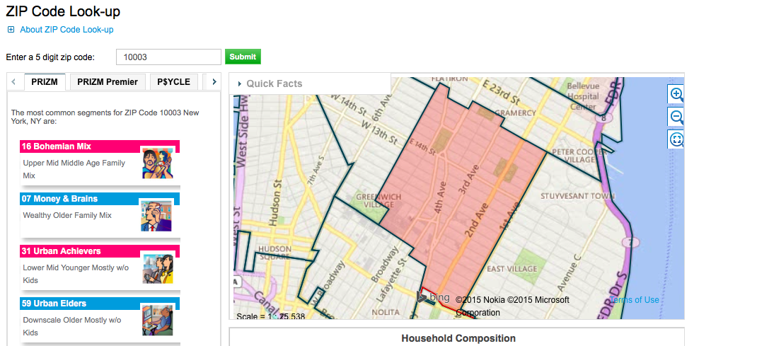
We received over thirty responses from the survey. It gave us a great base to start with, but we feared the pool we tested was not quite large enough to make the final decisions. In order to round out our data, we did additional research with Nielsen Prizm to learn more about the people who live within close proximity to the Hudson River and Estuary. This helped solidify our user personas and fleshed out our early designs for the site.
Initial Testing:
- Our comparative analysis brought us to the Hudson River Park website. Their information architecture and organization was strong and a good model for what we were looking to accomplish. It would be the perfect site to test usability.
- Before moving forward with the parallax, we needed to confirm it was the right decision for the client. We found two great parallax sites to use for our initial user tests, one on Highway One and the second on fracking.
- We also did preliminary sketches of how our parallax would tell the story of the Hudson and drawings of an interactive map to help discover activities on the river. Both of these sets of sketches would round out our initial user testing.
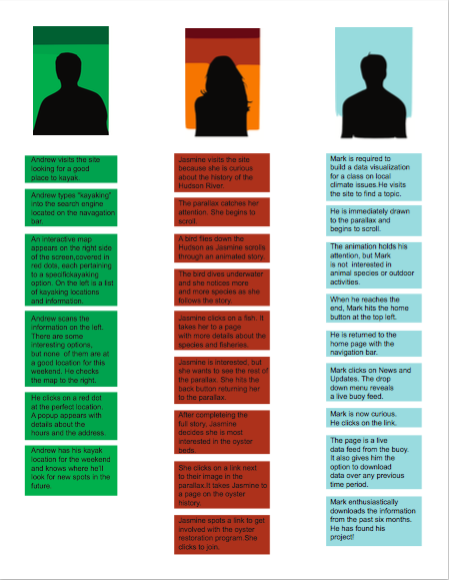
The results confirmed first and foremost the parallax was a great idea. Users responded both to the sites we tested and to our own sketches for our potential site. It also helped us solidify the information architecture and reminded us how important the search bar is to some users. The Hudson River Park website did have a really nice layout for the navigation bar, but it turned out their search results were much weaker and was a pain point to some of the users we tested.
Building our prototype:
- The parallax needed to be designed in a way to include links to all of the information available while telling a coherent story that keeps the user interested from beginning to end.
- We figured out clever transitions to smooth out the parallax as the story jumped location and time periods. These details were honed with each iteration in Axure.
- We tested our designs on our phones every step of the way to ensure the experience was as good on mobile as on desktop.
- We continued to user test each new idea, ensuring design decisions was backed up by our research results.
- At each point in the design process, we returned to the client’s requests to confirm that our decisions were always in line with their needs.
This week, the hardest part of the UX Design process for me was not doing the final designs for every aspect! Since I’m a filmmaker and now rapidly becoming a designer, visuals come to me very clearly, but when working as a group, only some of the deliverables were finished by me personally. And obviously not everyone sees things the way I do in my head. I guess over time when working with the same people, a rhythm and ability to understand each other would develop — it certainly works that way with my cinematographer when I direct. I can work with other DPs, but my favorite cinematographer understands me in a way that our combined visual skills are truly magnified when we work together as opposed to simply getting the job done adequately. I aspire to find that kind of collaboration on future UX projects.