mPower Me — The Full UX Process
- Post By: Jamie
- Date:
- Category: Spring 2016, UX Design
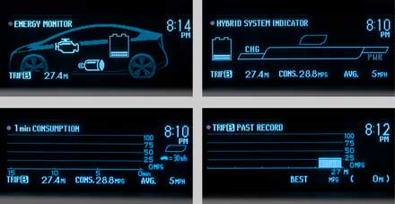
ELEVATOR PITCH: Ever wonder why Prius drivers are the most annoying drivers on the road? It’s because once there’s a live feed of the miles per gallon, the game of getting the best MPG outweighs speedy driving. I can confirm […]
Read MoreThe Prius Effect
- Post By: Jamie
- Date:
- Category: Spring 2016, UX Design
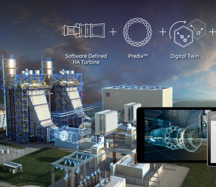
This week I spent some time emailing back and forth with Andrew Milmoe at GE Digital. He gave me options of things to use for my UX project. The project I found that might be most useful was a system […]
Read MoreUX at GE Digital
- Post By: Jamie
- Date:
- Category: Spring 2016, UX Design
Andrew Milmoe came to speak at NYU ITP this week about interaction design at GE Digital. The UX of the type of systems he works on is pretty incredible. Since we need to build a UX project about anything […]
Read MoreUX of Everything
- Post By: Jamie
- Date:
- Category: Spring 2016, UX Design

After completing a large UX project for Hudson River Foundation, it got me thinking about UX Design outside of simple web and mobile applications. As interesting as it has been learning how to test usability in regards to these mediums, […]
Read MoreYour Hudson + Harbor UX Design
- Post By: Jamie
- Date:
- Category: Spring 2016, UX Design

Your Hudson + Harbor is a new non-profit organization birthed from the merger of the Hudson River Foundation and the Harbor Estuary Program. Together the two NGOs focus on developing scientific research, providing leadership, integrating and disseminating information and coordinating […]
Read MoreResearch, Research, Research and Analysis
- Post By: Jamie
- Date:
- Category: Spring 2016, UX Design
I would say the number one surprising thing that occurred to me this week about UX Design is the importance of research and analysis. Before now, I understood everything was based on testing and iteration, but the artist in me […]
Read MoreHudson River Foundation
- Post By: Jamie
- Date:
- Category: Spring 2016, UX Design
UX design this week got a whole lot more interesting. For our next project, we are working with a real client, Hudson River Foundation. We heard directly from the client in class and were able to ask numerous questions clearing […]
Read MoreE Commerce: Adventures in Toyland
- Post By: Jamie
- Date:
- Category: Spring 2016, UX Design
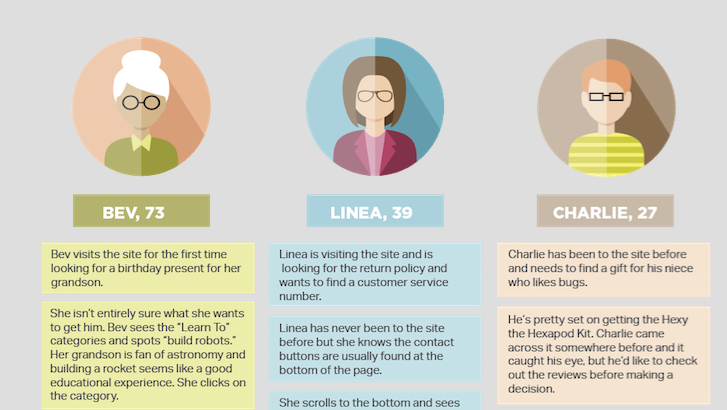
This project was as much an adventure in information architecture as it was in learning Axure! Fortunately both proved to be worth while endeavors. After reading the brief for Little Einstein Toy store, the first order of business was […]
Read MoreDesign Verses Usability
- Post By: Jamie
- Date:
- Category: Spring 2016, UX Design
A few quick thoughts on UX design mid our eCommerce project. I realized that designing from the perspective of the user experience was great until suddenly we needed one more button than I found visually pleasing. Design and usability are […]
Read MoreSubway Mate
- Post By: Jamie
- Date:
- Category: Spring 2016, UX Design
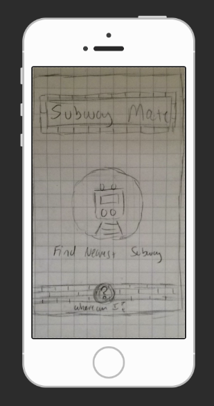
SUBWAY MATE PROBLEM: My partner, Sicong, lives in New Jersey. She commutes into New York often, but not often enough to buy unlimited metrocards. Sicong has trouble remembering if she has money left on her card and often ends up […]
Read More